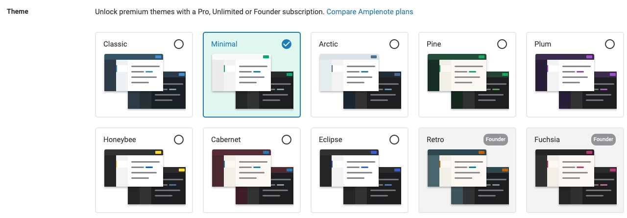
We are always increasing the options available to control how Amplenote is presented to the user. Options to control Amplenote appearance are primarily controlled by logging in to the web app, and visiting Settings -> Appearance. This help page will explain the options available on this settings page.
linkMode

Hopefully this one is pretty self explanatory. You can choose to force Amplenote on this device to use "Light" or "Dark" versions of the theme that is chosen. Or you can live carefree and just leave this set to "Match system," so your light/dark setting will change instantly when your OS setting changes.
linkTask completion effects

How grand of a celebration do you want upon completing a task? Regardless of which option you choose, we won't show any effects when you complete a normal, boring task with a gray border on its left edge, as shown here. This is because it's common to use Amplenote as a checklist (i.e., for grocery shopping), and chances are you don't have time for a magnificent celebration every time you stick milk or bananas in the cart.
If you choose Minimal, completed tasks will shrink out of view in about half a second, with fanfare kept to a minimum.
If you choose Normal, completing yellow and red tasks will generally trigger some stars to pop out of your task, unless the task had only derived its value from its start time being today. These animations are completed within one second. If you complete an Important task, you'll get an extra animated affirmation.
If you choose Dazzle, all bets are off. 😝 You'll just have to see for yourself what happens. Animations can take up to 2 seconds when "Dazzle," is chosen, but your cursor will be available/functional throughout the task animating away.
Don't forget to click "Update settings" if you change your Task Completion Effect level.
linkThemes

The main attraction of the appearance page is choosing your theme. Read all about themes here.